
Metrics Maketh Man: The Economic Indicators We Track Define Us
by Kendrick Leong, Hawaii Data Collaborative
What is the economy? A large question for a blog post, I admit. Even the Merriam-Webster Dictionary gives us the run-around; the general gist is that the economy encompasses all of the production, distribution, and consumption of goods and services in an area.
Distilling these myriad processes into something digestible for our readers is another issue. In my last blog post I reported on measures of gross domestic product (GDP), the unemployment rate, and retail and food sales. To get a bigger, better picture we also bring in some supplementary indicators: mobility, restaurant activity, and visitor arrivals and expenditures.
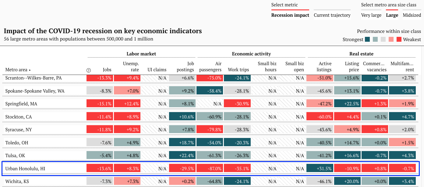
Several organizations have made great strides in gathering high-frequency (that is, how often indicators are updated, which can range from daily to quarterly and longer) economic data and creating easy-to-digest visualizations. The Brookings Institution’s COVID-19 Metro Recovery Index tracks twelve indicators for Urban Honolulu and compares the city’s performance against other metros of similar size. UHERO’s new Economic Pulse index (also available on COVID Pau) weights eighteen indicators to produce an easily-trackable economic “score”.
Selecting, curating, and weighting these indicators is no easy task. The challenge of summarizing the entire economy through individual indicators is akin to perfectly defining the word “economy” itself. There is an ongoing academic dispute (read: petty fight) over whether composite indicators or indices are inherently good or bad. Critics object to the arbitrary nature of the weighting process, or the extent to which the performance of individual indicators contributes to movement in a single “score” or composite indicator. Regardless, indices are powerful in their ability to showcase in one score what might not be apparent from examining multiple individual indicators in isolation.
I will take one step back from the debate and instead draw attention to why indicators are selected, rather than whether they should have been selected or combined at all. Our values as a society are revealed in the curation of economic indicators (whether for the Brookings dashboard or UHERO’s Economic Pulse) – we implicitly prioritize certain metrics by elevating them to a position within a dashboard or index. Let’s take a deeper look at a few specific indicators that illustrate this point.
Painting by Numbers
No look at our economy can be completely exhaustive, and I am loath to join the long line of writers itching to ask “Why did you include that indicator?” and “Why didn’t you include this one?” However, I’ll maintain, as in my previous blog post, that short of a completely exhaustive, objective assessment of the economy, each indicator contributes to our understanding of what economic health is and what it should look like.
The Brookings Metro Recovery Index is especially guilty of imposing normative values on economic indicators. Take for example, the measure of “Multifamily rent,” or “the average effective rent paid by a tenant in a multifamily property”. Since February, “Multifamily rent” in Urban Honolulu fell by 0.7%, apparently “underperforming” similar metro regions. Taking this dashboard’s presentation of this indicator at face value would suggest that lower rent is a bad thing, completely de-contextualizing our high housing burden, and the effects of high rent and mortgage payments on local financial health. In this dashboard, economic health is implicitly imagined as a hot housing market – one with numerous active listings, high list prices, and expensive multifamily rent.
Now, enough bashing of Brookings. Turning a blind eye to the normative coloring of indicators as good or bad, it is up to you, the reader, to interpret how directional movement in a metric aligns with your own perception of what economic health is. Does a higher average listing price suggest a market where local homeowners are better able to build wealth? Conversely, does a lower average listing price instead suggest local families may be better able to afford housing? It may be necessary to bring in additional data sets to make that judgment call, such as the numbers on first time home buyers.
I also invite you to reinterpret the indicators I have mentioned before, such as mobility. We previously tracked mobility in the hopes that we would get up and around again, back to pre-pandemic levels. The logic was that the health of our economy can be examined by proxy – noticeable increases in mobility to places like shopping malls and retail outlets might suggest people are spending money there. UHERO’s Economic Pulse index takes a similar view: time at groceries, parks, retail, transit, and work increases the Economic Pulse index “score,” while time spent at residential locations decreases it (get off the couch!). This kind of analysis is rather novel; we did not have as many devices that tracked our every move last recession. However, it may very well be the case that spending time at home has some economic benefits: higher worker morale and less time and money lost to commutes, for example, but the jury is still out about the effects of remote work on economic productivity.
Don’t Call It A Comeback: Value-Based Definitions of Economic “Recovery”
I have shown two cases where the curation of indicators may imply an imagined trajectory for economic recovery: the Brookings real estate indicators and local examinations of mobility. It is important to remember that every time we look at a graph or chart we not only see where we have been, we also imagine where we might go, and whether that imagined future would be “better” or “worse” than now. For example, we see a graph of retail purchases and naturally muse that a return to pre-pandemic levels is good. We recognize the importance of our local businesses. We enjoy shopping for clothes, or video games, or widgets and gizmos. Tracking this indicator tells us about the general health of our economy, but also allows us to express the value we place in being able to afford retail purchases.
Do you value the success of essential small businesses in disadvantaged neighborhoods? The Economic Tracker from Opportunity Insights tracks small business revenue in Hawaii, broken out by zip code income. How about an employment recovery that does not leave out vulnerable populations? Hawaii Workforce Infonet publishes unemployment claimant data grouped by several demographic characteristics.

We can never hope to monitor every aspect of the economy, although well-curated dashboards and soundly-crafted indices do help. But what we can do is align an imagined economic recovery with our own values by reviewing existing dashboards and indices (asking yourself the question: by selecting these indicators, what does the author want me to imagine our recovered economy will look like?) and by tracking a few specific indicators for ourselves.
That brings us back to the first question posed in this blog post: What is the economy? And perhaps more important during these times: What is economic recovery? I would say that hints to the answers to these two questions reside within the indicators we choose to track. We have written previously on the danger of letting data define the “thing” – in this case, letting dashboards and indices, and the data available to populate these composites, define what the economy and economic recovery looks like and should be. Therefore, we should be thoughtful in curating what data sources influence where we see ourselves to be, and advocate for new economic data sources that align with where we want to go (for example, job creation outside of the hospitality industry, or multigenerational housing affordability). Are we what we measure? I would say we choose to be what we are mindful of measuring.