
Seeing Red: Simplifying the Search for Meaningful Differences Across Geographic Communities
by Kendrick Leong, Hawaii Data Collaborative
Waldo Tobler, an American geographer, once said: “Everything is related to everything else, but near things are more related than distant things.” In my last blog post on diversity indices, we found that high diversity index scores across the state made it hard to draw any concrete conclusions about variations in racial, ethnic, and birthplace diversity across Hawaii’s census tracts. Tobler’s words of wisdom, his “First Law of Geography,” instead directs us to compare data at a more local scale.
“Seeing” Spatial Distribution Through Hotspot Analysis
Rather than comparing values at a state level, we can contextualize each area’s values by the degree to which they are related (or unrelated) to their neighbors. This logic undergirds a visualization of “spatial autocorrelation” – a fancy phrase that describes showing, within a certain area (spatial), whether high and/or low values cluster (autocorrelation). Through this “hotspot analysis,” we can compare local clusters to the statewide average and observe spatial distributions of high and low values.
The series of maps we’ll take a look at in this blog post are based on American Community Survey (ACS) data from 2017 depicting the percentage of the population receiving any form of public assistance funds (such as SNAP, the Supplemental Nutrition Assistance Program).
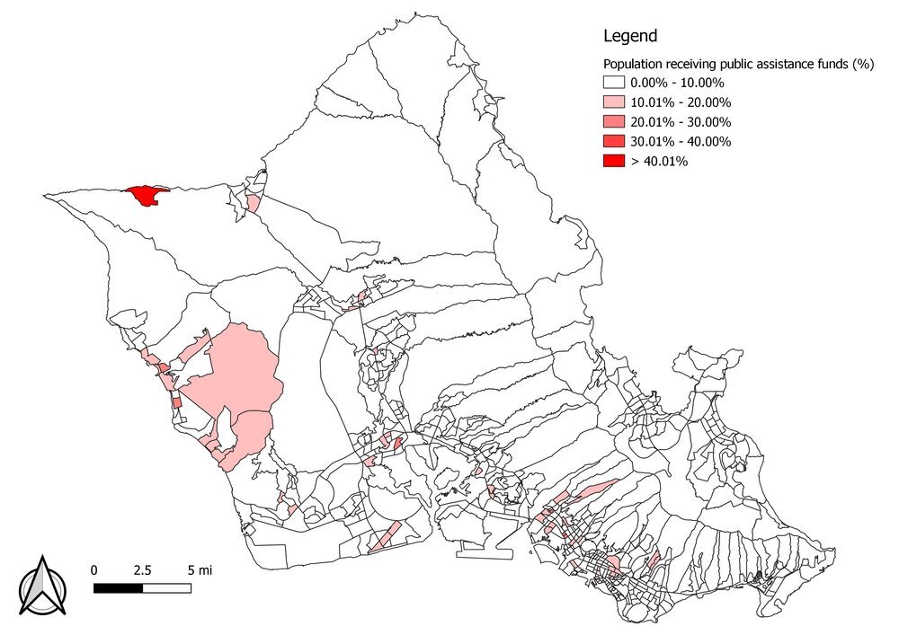
For the island of Oahu, we can identify some census block groups where the rate of public assistance recipiency is greater than 10 percent. We can also document the minimum value (0 percent) and maximum value (44 percent). However, a similar problem to one we encountered in the diversity index blog post arises: how do we draw meaningful insights from “similar” values across the board?
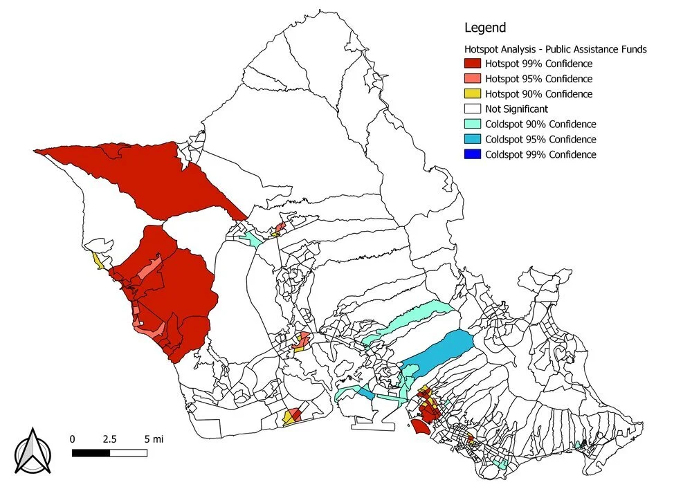
Rather than drawing conclusions by comparing percentage points, a hotspot analysis such as the one above visualizes hot spots—i.e., areas where high values are clustered—and cold spots—i.e, areas where low values are clustered. Because this is a statistical analysis, the different colors don’t represent absolute values but rather confidence intervals. This visualization helps us answer the question: “How confident are we that the values in any given census block group represent a spatial clustering of high values (a hot spot) or low values (a cold spot)?”
Advantages of Hotspot Analysis
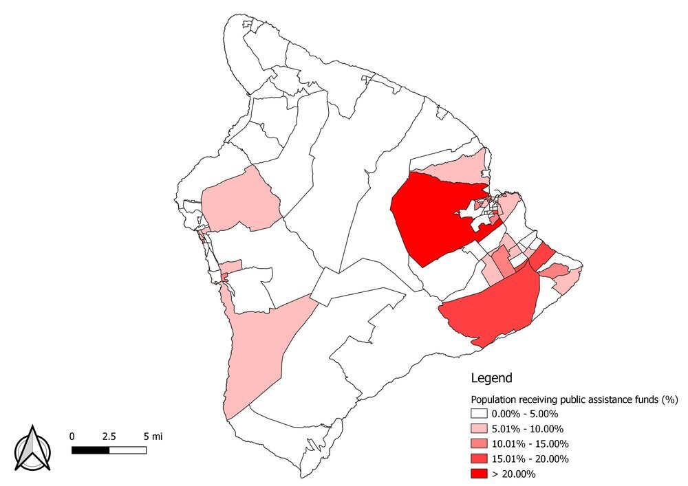
A major advantage of a hotspot analysis is that it avoids problems that arise from manipulated symbology. That is, mapmakers can subtly adjust the numbers in the legend, leading you (intentionally or not) to interpret data a certain way. Did you notice anything different between the above map of population percentages on the Big Island compared to the first Oahu map? Although the colors are the same, the range of values is much smaller. The above map of Hawaii Island has a maximum value of 22.5 percent, compared to a maximum value of 44 percent on Oahu, yet a map can lead you to believe that the two areas are similar by painting them the same shade of red.

Rather than depicting absolute values as different shades of red, a hotspot analysis draws our attention to outlier values and spatial clustering. Hawaii Island’s maximum value of 22.5 percent is not high when compared to other places statewide. However, the hotspot analysis reveals areas on Hawaii Island where, when compared to only the Hawaii Island average, a relatively high percentages of households receive some form of public assistance.
A second advantage of a hotspot analysis is the ability to compare hot spots to cold spots. Many choropleth maps (the ones with different colors representing different values) may be difficult to read because they represent absolute values. How red is that red? How much redder is this red from that red and what percentage difference does that correspond to? These are some questions you may be asking yourself when looking at a choropleth map. With a hotspot analysis, we pare away the marginal differences between census block groups to focus our attention on just two kinds of clusters. Warm colors representing hot spots can be easily distinguished against cool colors representing cold spots, and against null values (white, in these maps) where spatial clustering is not statistically significant. In the above map of Hawaii Island, we can easily compare a hot spot in the southeast with a cold spot in the north.
Reframing Comparisons: Thinking Spatially, Rather than Numerically
As a final note, merely changing the way data is presented doesn’t provide an easy answer for policy recommendations or program targeting. Instead, we are simply reframing how we think about comparisons. Rather than trying to create meaning out of marginal percentage or score differences, through a hotspot analysis we can reveal spatial clustering patterns, determine if they are statistically significant, and make better sense out of how (and also posit why) high and low values are distributed.
For the sake of completeness, below are the hotspot analysis maps for Kauai and Maui Counties:


Getis, A., & Ord, J. K. (2010). The analysis of spatial association by use of distance statistics. In Perspectives on Spatial Data Analysis (pp. 127-145). Springer, Berlin, Heidelberg.
Oxoli, D., Zurbarán, M., Shaji, S., & Muthusamy, A. K. (2016). Hotspot analysis: a first prototype Python plugin enabling exploratory spatial data analysis into QGIS. In Open Source Geospatial Research & Education Symposium (OGRS2016) (pp. 1-6). PeerJ Inc. San Francisco, USA.